How to connect Google Analytics to R using the googleAnalyticsR package
Sometimes, it's just easier to access your Google Analytics (GA) data through it's API especially if you want to do any statistical analysis. I find that sometimes the GA interface can be slow or unresponsive not to mention it takes time to access the report you want and then you need to export your data. Sometimes I dread having to go into GA.
However, using the API, can save a lot of time especially if you use R. The googleAnalyticsR package makes getting your GA data super easy! Here's how to go about accessing your data through R.
#install and load packages
if(!require("googleAnalyticsR")){
  install.packages("googleAnalyticsR")
  library(googleAnalyticsR)
}
#authorize Google Analytics
ga_auth()
#get account info so you can see what accounts you have access to
account_list<-ga_account_list()
#take a look at your accounts
account_list
#assign the view you want to connect to the view_id variable
#it is the viewID column
view_id<-123847950
In order to get the API names you will need you can use the Query Explorer which will allow you to practice your queries or the Dimensions & Metrics Explorer.
#lets pull some data--the last 30 days of channel data
channels<- google_analytics_4(view_id,
                               date_range = c(Sys.Date() - 30, Sys.Date()),
                               metrics = c("sessions", "pageviews", "entrances", "bounces"),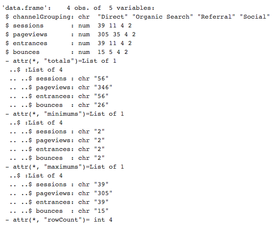
dimensions = "channelGrouping")#check out the structure str(channels)
#for date range you can also use the API's relative dates
channels<- google_analytics_4(view_id,
                              date_range = c("30daysAgo", "yesterday"),
                              metrics = c("sessions", "pageviews", "entrances", "bounces"),
                              dimensions = "channelGrouping")
#lets pull the same data but using a custom date range
channels<- google_analytics_4(view_id,
date_range = c("2017-01-01","2017-05-17"),
metrics = c("sessions", "pageviews", "entrances", "bounces"),
dimensions = "channelGrouping")#lets view our new data channels

#visualize our sessions by channel with an annotated pie chart including percentages
slices<-channels$sessions
lbls<-channels$channelGrouping
pct<-round(slices/sum(slices)*100)
lbls<-paste(lbls, pct) #add percent to labels
lbls <- paste(lbls,"%",sep="") # add % to labels
pie(slices,labels = lbls, col=rainbow(length(lbls)),
    main="Sessions by Channel")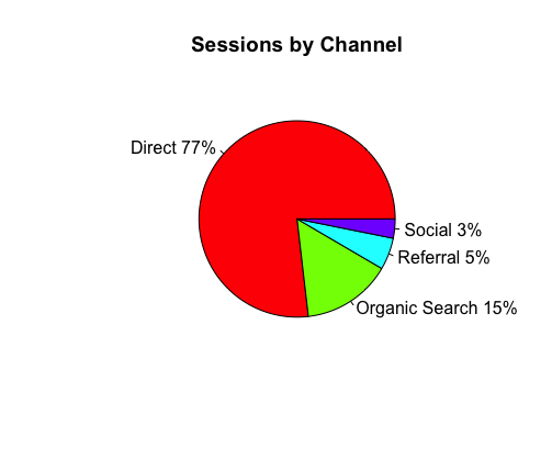
#create a bar chart in case you hate pie charts
library(ggplot2)
ggplot(data = channels, aes(x = channelGrouping, y = sessions, fill = channelGrouping)) +
  geom_bar(stat = "identity", show.legend = FALSE) +
  theme_light()

#lets check device categories of our visitors--the last 30 days
device_info<- google_analytics_4(view_id,
                              date_range = c("30daysAgo", "yesterday"),
                              metrics = "users",
dimensions = "deviceCategory")#lets view our data device_info

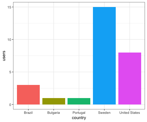
#where are my visitors located
country_info<- google_analytics_4(view_id,
                                 date_range = c(Sys.Date() - 30, Sys.Date()),
                                 metrics = "users",
                                 dimensions = "country",
                                 order = order_type("users",
                                sort_order=c("DESCENDING"),
orderType = c("VALUE")))#let's take a look country_info

#visualize our users by country with an annotated pie chart including percentages
slices<-country_info$users
lbls<-country_info$country
pct<-round(slices/sum(slices)*100)
lbls<-paste(lbls, pct) #add percent to labels
lbls <- paste(lbls,"%",sep="") # add % to labels
pie(slices,labels = lbls, col=terrain.colors(length(lbls)),
main="Users by Country", cex=.9, radius=1)

#use barplot if you have lots of country segments
ggplot(data = country_info, aes(x = country, y = users, fill = country)) +
  geom_bar(stat = "identity", show.legend = FALSE) +
  theme_bw()
With the metrics and dimensions explorer, you now have the power to access your analytics data however you like. My data tells me I have a lot of work to do. Happy analyzing!