Web Analytics Data + Tableau: Where Tableau Shines
One aspect of my job is deciding which tool to use for data analysis. Google Analytics? Google sheets? Excel? Tableau? Sometimes I do analysis on the fly and sometimes I want to track certain metrics over time. In that case, I might have an Excel or Google sheet with all my metrics that I update each month. It's easy and most of the time it's a breeze but if I need to see how a metric has changed over time, it can get tricky.
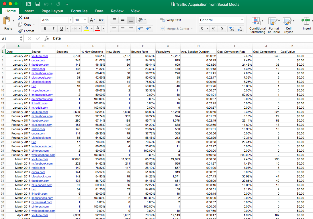
Here's an example of a report from Google Analytics. The data comes from Google's Merchandise Store. It's a custom report that tracks traffic acquisition from social media. You can pull the same report yourself from Google Analytics Solutions Gallery. (It's a good one to have!)

However, If I need to do some data visualization, it gets tricky to do in Excel. Here is my dataset from the report. Column A is the month and year. Column B, the social channel. Column H, the conversion rate and the metric I want to see how it has changed over time.
So I decide to create a chart with these 3 columns and this is what happens.
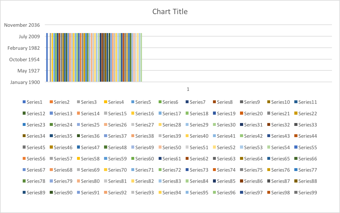
Yikes!
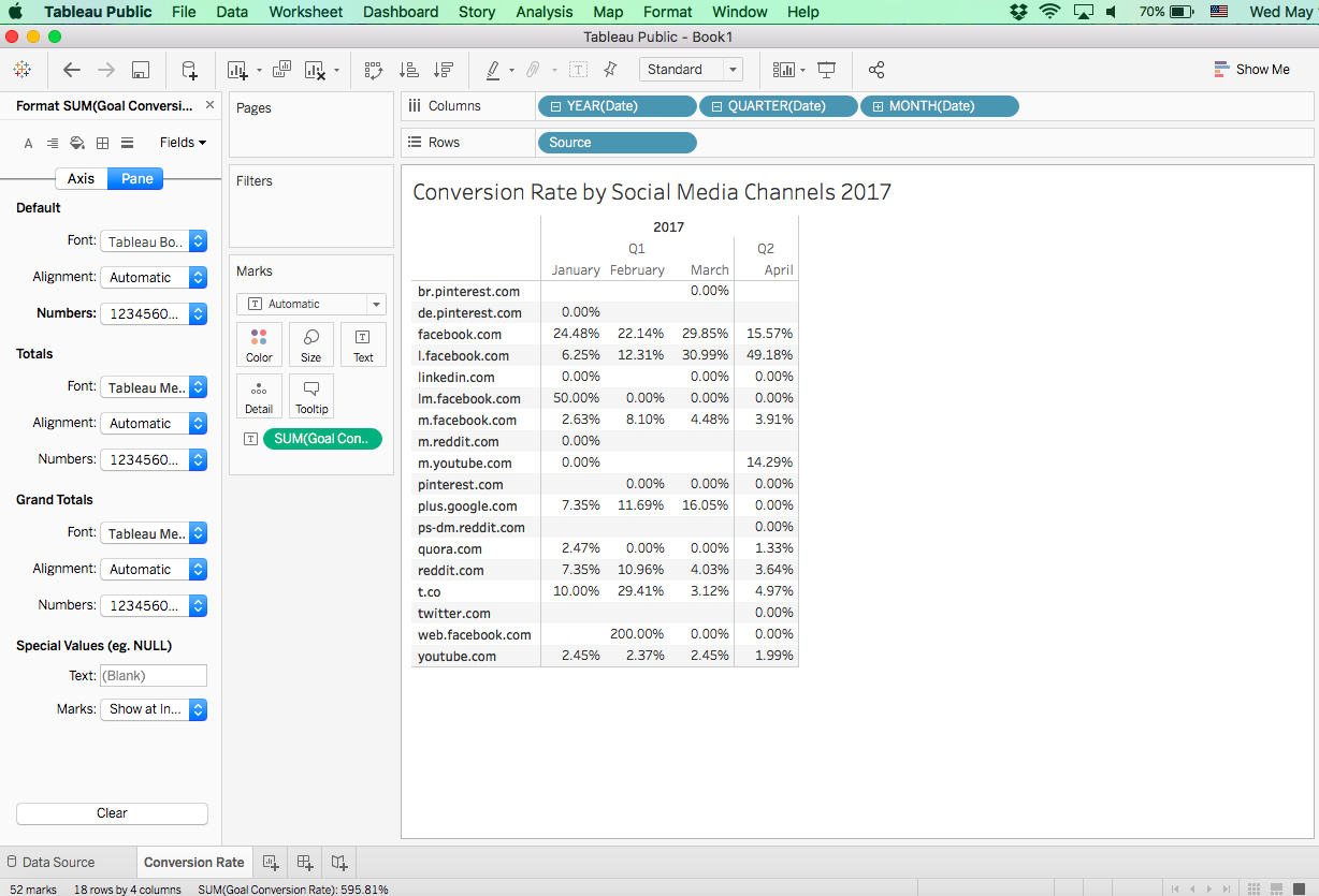
Ok, so that didn't work. Excel didn't know what to do with my chart and I would need to do a lot of work to get what I want. I decide to create a pivot table and chart instead. Here is what I get.

Note: I'm using Excel for Mac which does not have the PivotChart option.
Ok, I'm closer but not exactly what I want and I would need to do a lot of work to get this right and I'm limited since I'm not using the Windows version of Excel. So I decide to just simply use Tableau.
Much better!
Wow. All I had to do was connect my Excel spreadsheet. Drag over my Source to the row shelf, drag the date to the column shelf, drag my conversion rate to the text label and format my conversion rate back to percentage and my data is ready for further analysis and visualization.
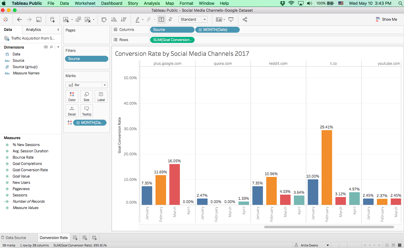
Nice! This is exactly what I wanted and I didn't have to work so hard for it.
I decided to go the next step and visualize my data as a bar graph. I've cleaned up my data. Now I can really dig into my media channels to see how they are performing.
That was quick, easy, and one of the biggest benefits of Tableau. All the data querying is done underneath the hood with no coding required by the user. It's intuitive and works the way you expect it to. Kudos to Tableau!