How to create a correlation matrix in R
I really love correlation analysis. It's an awesome way of determining if two numeric variables have a relationship. You can also determine how strong the relationship might be. If you are looking at just 2 variables this is where the scatterplot comes into play. If you have many variables to compare, a correlation matrix is just what you need.
I decided to create a step-by-step guide on creating a correlation matrix using the R programming language. The first step is finding a dataset to use. I'm using a dataset from an online statistics course at Penn State. The data is from a study researching if a person's brain size, weight, and height can predict intelligence.
#import data from url into R Studio using read.table function
iqSize<-read.table("https://onlinecourses.science.psu.edu/stat501/sites/onlinecourses.science.psu.edu.stat501/files/data/iqsize.txt", header = TRUE)
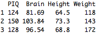
#check dataframe
#this is an American dataset, so the participant's weight is in pounds not kilos!
head(iqSize, 3)
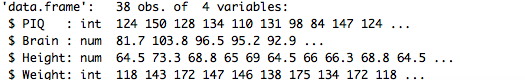
#inspect the structure of your dataset
str(iqSize)
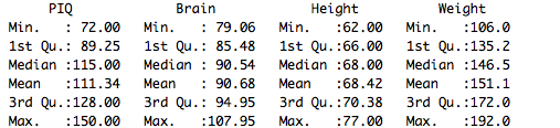
#use the summary function to get a run down on your dataset
#it provides a summary of all the data in your dataset
summary(iqSize)
#use the base plot function to plot all your variables in a scatterplot
plot(iqSize)
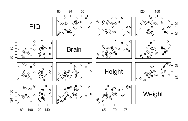
This plot allows us to visualize the relationship among all variables in one image.
We can see that height and weight suggests a positive correlation. (4th column, 3rd row from the top)
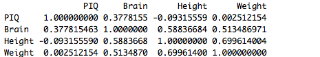
#let's calculate correlation
corr<-cor(iqSize)
The corr() function calculates the Pearson's correlation coefficient and creates a new matrix in your environment.
#inspect matrix
corr
#let's visualize our matrix
#install ggcorrplot if needed
if(!require(devtools)) install.packages("devtools")
devtools::install_github("kassambara/ggcorrplot")
#load visualization libraries ggplot2 and ggcorrplot
library(ggplot2)
library(ggcorrplot)
#plot the correlation matrix visual
ggcorrplot(corr)

#add correlation coefficients & reorder matrix using hierarchical clustering
ggcorrplot(corr, hc.order = TRUE, type = "lower", lab = TRUE)
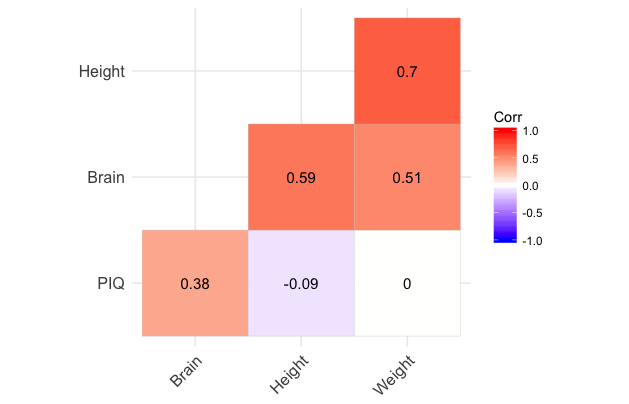
Now that looks better!
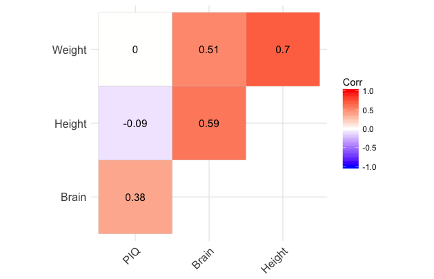
#you can also display the upper triangular of the correlation matrix by changing the type from 'lower' to 'upper'
ggcorrplot(corr, hc.order = TRUE, type = "upper", lab = TRUE)
#you can also plot the matrix using circles
ggcorrplot(corr, lab = TRUE, type = "lower", method="circle")
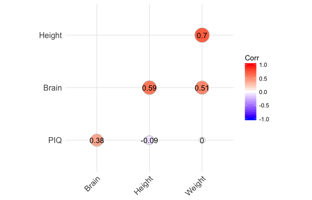
Now you have your correlation matrix with the corresponding correlation coefficients for easy visualization.
If you want to continue the example on the Stat 501 course page to get your regression equation, residuals, and R-squared, use the fit function to run your regression analysis similar to the example shown using Minitab.
fit <- lm(PIQ~ Brain + Height + Weight, data=iqSize)
summary(fit)

A correlation matrix is a great way of visualizing numeric data if you want find out if your variables are correlated. Happy analyzing!