Data Visuals: How to Convey Your Data Story
After recently finishing Duke University's Data Visualization and Communication with Tableau course on Coursera, which I highly recommend by the way, I definitely learned a few new skills and tools when it comes to presenting data to non-tech audiences. First and foremost is choosing the right data visualization for your data. Generally speaking, bar charts and line charts are the best way to visualize data in presentations.
How should bar and line charts be used?
Bar Charts:
- Should be used in comparing measures of different groups or categories.
- Appropriate when you want to show aggregated data rather than raw data.
Line Charts:
- Line charts are best for looking at how values and categories vary over time
- Line charts should be made into bar charts when the ticks on the x-axis don’t have a specific, inherent, sequential order.

What about pie charts?
Visualization and data science communities HATE pie charts for one main reason: Pie charts do not convey detailed or specific information well. However, they may be useful in certain situations because they can convey general patterns about percentages.
So when are pie charts useful?
- When you are communicating categories that add up to 100%.
- When you are going to highlight four or fewer categories (preferably no more than two categories).
What about scatter plots?
Scatter plots show the relationship between two variables particularly continuous variables. They are used to show raw data but it is possible to show aggregated data as well.
Should scatter plots be avoided?
Generally, yes. For non-technical audiences they can be overwhelming. Only use for tech audiences!
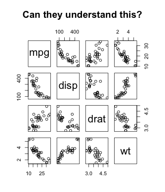
Scatterplot Matrix using the mtcars dataset in R.
Don't get me wrong, scatterplot visualizations are a powerful tool and this article from R-Bloggers is wonderful for showing you how to properly use scatterplots but I would advise to use scatterplots only if your audience knows how to read them.
What charts should be left out of your business presentation?
Good grief, 3D charts should be avoided! You don't want your audience as lost and confused as the little girl stuck in another dimension in that old Twilight Zone episode.
It's not a competition to have the most creative and stunning visuals for your presentation. The main purpose for your data visuals are that they are understood by everyone, so it's best to keep your visuals as simple as possible.